Pei-Chi Chiu | April 2, 2026
This is the second article in the AIAG-VDA SPC 2026 New Edition Series, systematically introducing the principles, formulas, applicable scenarios, and selection logic of 8 control chart types and 5 major statistical analysis tools. All content is based on the original text of the AIAG-VDA SPC Manual 1st Edition (2026) yellow book.
Series Articles
Part 1: AIAG-VDA SPC 2026 New Edition Key Changes Explained (Cpk/Ppk definition changes, out-of-control rules)
Part 2: SPC Control Charts Complete Guide (this article)
Part 3: Advanced Control Charts and Pearson Non-Normal Analysis
I. Variables Charts
Variables charts are used to monitor measurable continuous data (length, weight, temperature, voltage, etc.). Different chart types are chosen based on subgroup size and data characteristics.
01 Average-Range Chart (X̅-R Chart)
The most fundamental variables chart, suitable for scenarios where the subgroup size is usually smaller than 10 (AIAG & VDA, 2026, §10.3.3.3, p.95: “usually smaller than 10”).
- The X̅ chart monitors process mean shift; the R chart monitors process variation (within-subgroup spread)
- Control limits: calculated based on distribution quantiles and standard deviation estimates. In the literature, they are often simplified using constants such as A₂, D₃, D₄ (AIAG & VDA, 2026, §10.3.3.3, p.95: “In literature, the parameters… are often summarized in tables with different designations e.g., A2”)
- Variation estimate: σ̂w = R̄/d₂
Application scenario: suitable for cases where the range is to be monitored rather than the standard deviation (AIAG & VDA, 2026, §10.3.3.3: “Apply if the range is to be monitored instead of the standard deviation”).
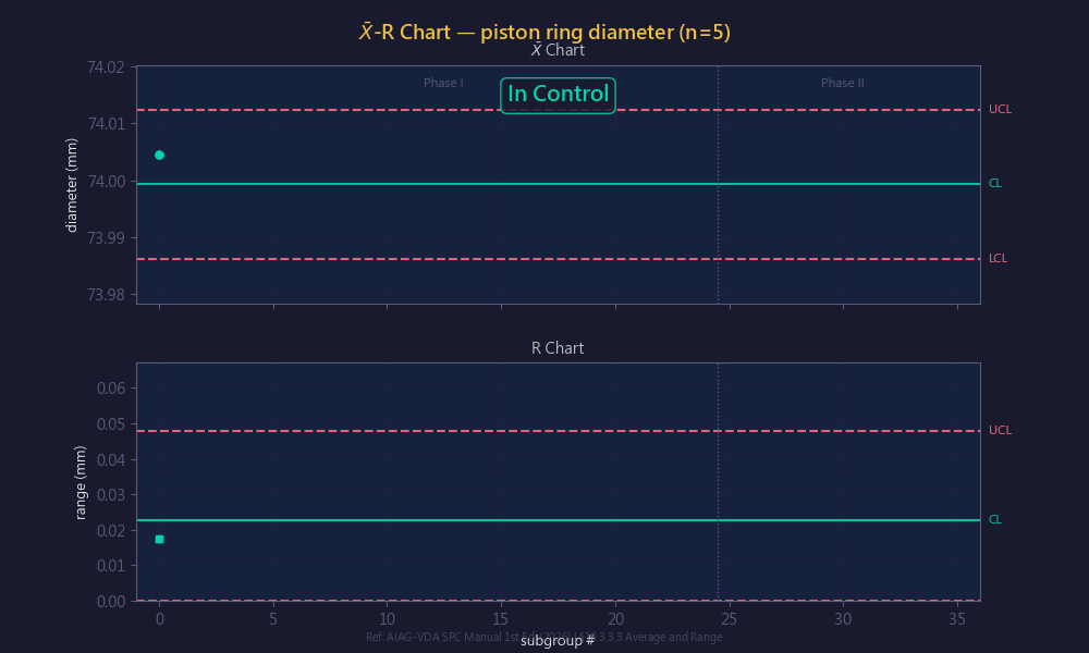
Advantage: simple to calculate and easy for shop-floor operators to understand.
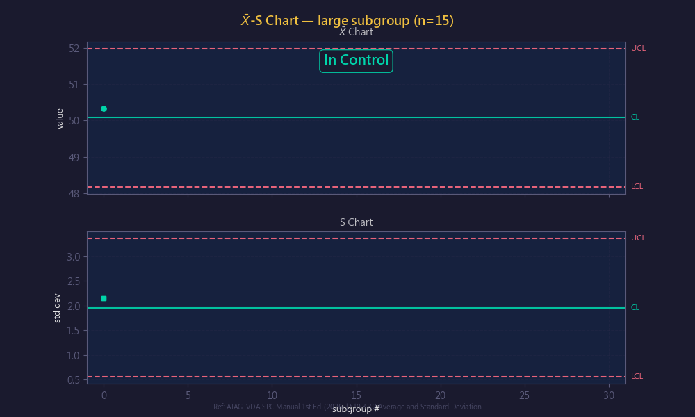
02 Average-Standard Deviation Chart (X̅-S Chart)
Used when subgroup size n > 10 or when a more precise variation estimate is needed (AIAG & VDA, 2026, §10.3.3.2, p.92).
- The S chart replaces the range R with the standard deviation s, providing higher statistical efficiency — with large samples, R loses information
- Control limits: UCL(X̅) = X̿ + A₃s̄; LCL(X̅) = X̿ − A₃s̄; UCL(s) = B₄s̄; LCL(s) = B₃s̄
- Variation estimate: σ̂w = s̄/c₄ (more precise than R̄/d₂, with the difference being especially significant when n > 10)
Application scenarios: semiconductor wafer thickness, PCB solder joint height, precision machining — suitable for highly automated production lines where automated measurement equipment (CMM, AOI) can provide large subgroups.
03 Individuals-Moving Range Chart (I-MR Chart)
The only option when each sampling yields a single measurement value (n = 1) (AIAG & VDA, 2026, §10.3.3.5, p.101).
- The I chart monitors the individual value Xᵢ; the MR chart monitors the moving range of consecutive observations MRᵢ = |Xᵢ − Xᵢ₋₁|
- Variation estimate: σ̂ = MR̄/d₂(2) = MR̄/1.128
- UCL(I) = X̄ + 3σ̂; UCL(MR) = D₄(2) × MR̄ = 3.267 × MR̄
Application scenarios: destructive testing, chemical analysis (one result per batch), long-cycle processes (one data point per day).
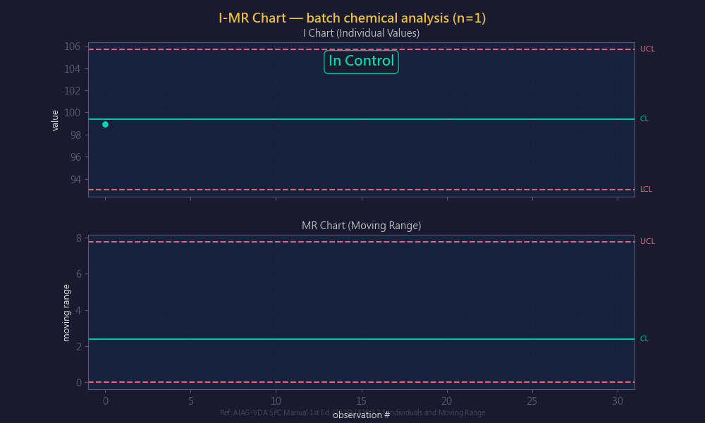
Note: it is more sensitive to the normality assumption; it is recommended to first perform a Shapiro-Wilk or Anderson-Darling test. If the data is non-normal, consider a Pearson non-normal control chart or a Box-Cox transformation.
04 Median-Range Chart (Median-R Chart)
A simplified control chart that replaces the mean x̄ with the median x̃ (AIAG & VDA, 2026, §10.3.3.4, p.98).
- The calculation requires no addition or division; the operator simply circles the middle value directly within the subgroup data
- The median has higher robustness against outliers than the mean
- It reacts more slowly to unstable conditions than the X̅ chart (AIAG & VDA, 2026, §10.3.3.4: “react more slowly to unstable conditions compared to x̄-charts”), trading off sensitivity for shop-floor convenience
- The R chart portion is exactly the same as in X̅-R
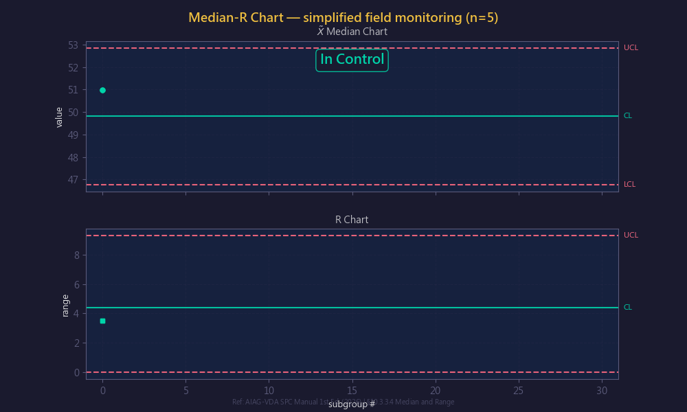
Application scenarios: traditional production lines that do not use calculators, training scenarios.
Variables Chart Selection Decision
| Condition | Recommended Chart | Rationale |
|---|---|---|
| n = 2~10 | X̅-R | Most fundamental, easy to understand on the shop floor |
| n > 10 or automated measurement | X̅-S | Higher statistical efficiency |
| n = 1 (destructive/long-cycle) | I-MR | The only option |
| Traditional production lines without computation tools | Median-R | No calculation needed, high robustness |
II. Attributes Charts
Attributes charts are used to monitor classification or count data (conforming/nonconforming, number of defects). The key to selection lies in two dimensions: “what to monitor” and “whether the sample size is fixed.”
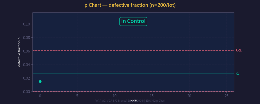
05 Fraction Nonconforming Chart (p Chart)
Monitors the binomial classification of conforming/nonconforming, with a variable sample size (AIAG & VDA, 2026, §10.3.6.2, p.117).
- Formula: p̄ = Σdᵢ/Σnᵢ; UCL = p̄ + 3√(p̄(1−p̄)/nᵢ); LCL = max(0, p̄ − 3√(p̄(1−p̄)/nᵢ))
- The control limits take a stepped shape as n varies
- Based on the binomial distribution B(n,p); the normal approximation holds when np̄ ≥ 5 and n(1−p̄) ≥ 5
Application scenarios: IQC incoming inspection, FQC outgoing inspection, monitoring of process nonconformance rate trends.
06 Number Nonconforming Chart (np Chart)
The same binomial classification as the p chart, but requires the sample size n to remain fixed (AIAG & VDA, 2026, §10.3.6.3, p.121).
- Directly monitors the number of nonconforming items np rather than the rate p — more intuitive on the shop floor (“5 nonconforming” is easier to understand than “5% nonconformance rate”)
- The control limits are fixed horizontal lines (they do not vary with the sample), making interpretation simpler than the p chart
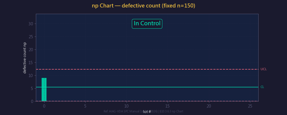
Application scenarios: fixed-batch production lines, such as LED packaging (100 units per batch), connector crimping (50 pieces per batch).
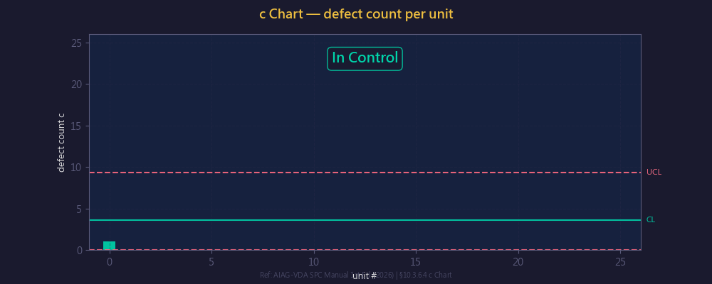
07 Count of Defects Chart (c Chart)
Counts the number of defects on a single inspection unit, with a fixed inspection unit size (AIAG & VDA, 2026, §10.3.6.5, p.124).
- Key difference: p/np monitor the “number of nonconforming items” (each item is counted as either conforming or nonconforming), while c/u monitor the “number of defects” (each item may have multiple defects)
- Based on the Poisson distribution. The traditional normal-approximation formula is UCL = c̄ + 3√c̄, but the new 2026 edition explicitly states that, given today’s typical use of software, the normal approximation should be avoided in favor of exact Poisson distribution quantile calculations (AIAG & VDA, 2026, §10.3.6.5, p.124: “The approximation of the control limits using the normal distribution… should be avoided, given today’s typical use of software”)
- Applicable conditions: defects occur independently, the probability of occurrence is low, and the inspection area/length/volume is fixed
Application scenarios: PCB solder joint defect count, fabric flaw points, coating bubble count, casting sand-hole count.
08 Defects Per Unit Chart (u Chart)
The same Poisson defect counting as the c chart, but with a variable inspection unit size (AIAG & VDA, 2026, §10.3.6.4, p.123).
- u = number of defects / number of inspection units (defect density); the control limits vary with the number of inspection units nᵢ
- Traditional formula: ū = Σcᵢ/Σnᵢ; UCL = ū + 3√(ū/nᵢ). As with the c chart, the new edition recommends using exact Poisson quantiles rather than the normal approximation (AIAG & VDA, 2026, §10.3.6.4, p.123)
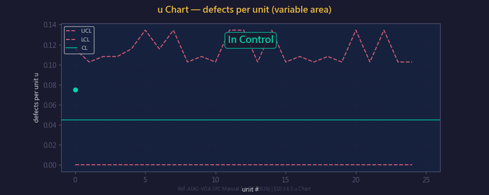
Application scenarios: solder joint defect density of PCB boards of different areas, insulation defect rate of cables of different lengths.
Attributes Chart Selection Decision
| What to monitor? | Fixed sample size | Variable sample size |
|---|---|---|
| Nonconforming items (conforming/nonconforming) | np chart | p chart |
| Number of defects (multiple possible per item) | c chart | u chart |
III. Statistical Tools
The following 5 tools are not control charts, but rather auxiliary analysis tools used before and after implementing SPC. Among them, the histogram and the normal probability plot are key prerequisite analyses for selecting the control chart type.
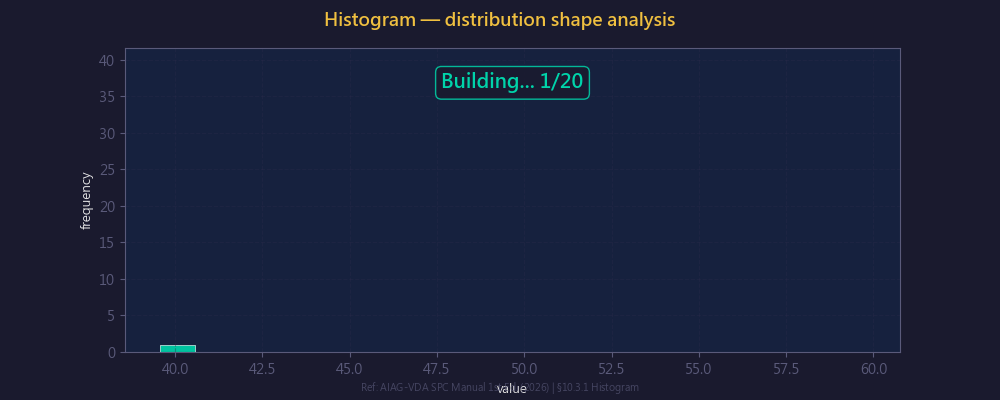
09 Histogram
Groups continuous data and presents the distribution shape as a bar chart. The recommended number of groups follows Sturges’ Rule: k = 1 + 3.322 × log₁₀(n).
- Diagnostic function: bell-shaped (normal), bimodal (mixed materials / two machines combined), skewed (process off-center), truncated (data after screening)
- Overlaying specification lines allows intuitive assessment of process capability: whether the distribution falls between USL/LSL
- Complementary to control charts: control charts look at time-series stability, while the histogram looks at the overall distribution location and spread
10 Normal Probability Plot
A graphical tool for verifying whether data conforms to a normal distribution (a special form of the Q-Q Plot); refer to §7.8.1 for distribution assessment.
- Data points aligned along a 45° straight line → normal; S-shaped curve → skewed; tails deviating → heavy-tailed/light-tailed
- Combine with the Anderson-Darling test (sensitive to the tails) or the Shapiro-Wilk test (best power for small samples)
- Importance: all Shewhart control charts assume the data is approximately normal. If non-normal → a Pearson control chart, Box-Cox transformation, or nonparametric method is needed
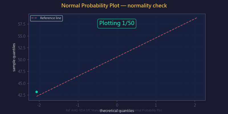
AIAG-VDA recommends that a normality test be mandatory before establishing a control chart; this is the key decision basis for selecting the control chart type.
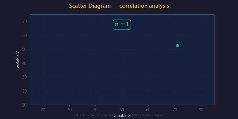
11 Scatter Diagram
Displays the correlation between two continuous variables. Combine with the Pearson correlation coefficient r (-1 ≤ r ≤ 1) for quantitative assessment.
- Positive correlation (↗), negative correlation (↘), no correlation (uniform scatter), nonlinear correlation (curve)
- Note: correlation does not equal causation (correlation ≠ causation); professional knowledge is needed for judgment
- Its role in SPC: identifying the key process parameters X that affect the quality characteristic Y (CTQ → CTP linkage)
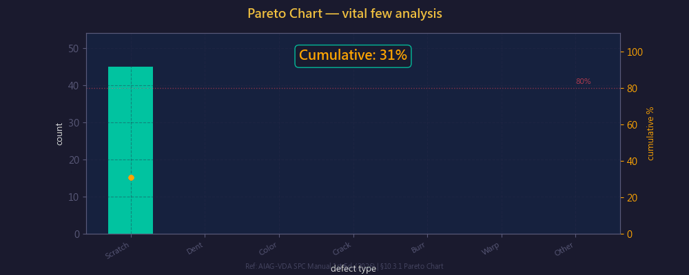
12 Pareto Chart
Based on the Pareto 80/20 rule, sorts defect items in descending order of frequency.
- Bar chart (frequency of each item) + cumulative percentage line chart (items accumulating up to 80% are the key items)
- Its role in the PDCA cycle: in the Plan phase, use the Pareto chart to select improvement topics → in the Check phase, compare before and after improvement
- Advanced technique: a cost Pareto chart (sorted by loss amount) reflects economic impact better than frequency
13 Run Chart
The simplest time-series chart, using the median as the baseline, with no statistical control limits.
- Runs Test: count the number of runs crossing the median; p < 0.05 → non-random
- Detectable patterns: trends, shifts, cycles, clustering
- Suitable for exploratory analysis before SPC implementation, as well as for trend monitoring in R&D / laboratory environments
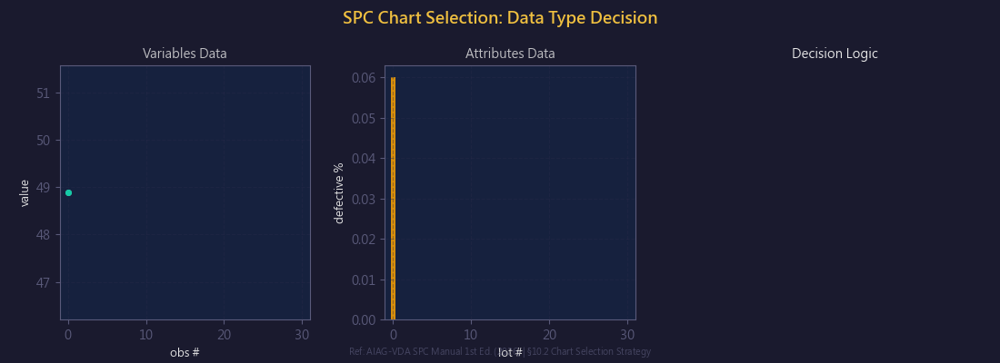
IV. Overall Control Chart Selection Decision Process
Below is the complete chart-selection logic compiled from the AIAG-VDA 2026 yellow book:
| Step | Decision Question | Choice |
|---|---|---|
| 1 | Data type? | Variables → Step 2; Attributes → Step 5 |
| 2 | Subgroup size n? | n = 1 → I-MR (Step 3); n = 2~10 → X̅-R; n > 10 → X̅-S |
| 3 | When n = 1, is the data normal? | Normal → I-MR; Non-normal → Pearson control chart (see Part 3) |
| 4 | Need to detect small shifts (< 1.5σ)? | Yes → CUSUM or EWMA (see Part 3); No → a Shewhart chart suffices |
| 5 | Monitor nonconforming items or number of defects? | Nonconforming items → Step 6; Number of defects → Step 7 |
| 6 | Is the sample size fixed? | Fixed → np; Variable → p |
| 7 | Is the inspection unit size fixed? | Fixed → c; Variable → u |
Frequently Asked Questions (Q&A)
Q1: Will the results of the X̅-R and X̅-S charts differ much?
When n ≤ 10, the difference between the two is minimal. But when n > 10, R loses information (the range uses only the maximum and minimum values), and the statistical efficiency of the S chart is significantly superior to the R chart. Automated measurement systems typically produce large subgroups, so the X̅-S chart should be preferred.
Q2: The control limits of the p chart are stepped — how do I interpret them?
Because each batch has a different sample size, the limits vary with n. In practice, you can use the “average sample size” to draw fixed limits as a simplified version (when the n of each batch differs by ≤ 25%), but strictly speaking the limits should be calculated batch by batch.
Q3: How do I choose between the c chart and the u chart?
It depends on whether the inspection unit size is fixed. For example, use the c chart for the same PCB model (fixed area); use the u chart when PCBs of different sizes are mixed on the line (defect density = number of defects / area).
Q4: The histogram shows a bimodal distribution — what does that mean?
It usually means the data comes from two different populations (mixed materials, two machines combined, large differences between two shifts). You should first perform a stratified analysis, find the root cause, and then control them separately. Building a control chart directly on bimodal data is incorrect.
Q5: What is the difference between a run chart and a control chart?
A run chart has no statistical control limits and only uses the median as a baseline for visual trend judgment. It is suitable for exploratory analysis before SPC implementation and for non-mass-production environments. A control chart, on the other hand, has ±3σ limits and out-of-control rules, providing an objective basis for statistical testing.
References
- AIAG & VDA (2026). Statistical Process Control SPC Manual, 1st Edition, §10.3.3 (Variables Charts), §10.3.6 (Attributes Charts).
- AIAG (2005). Statistical Process Control SPC Manual, 2nd Edition.
- Montgomery, D.C. (2019). Introduction to Statistical Quality Control, 8th Edition. Wiley.
This article was written by the quality engineering team at MiDFUN, based on an analysis of the original AIAG-VDA SPC Manual 1st Edition (2026).
For SPC system implementation consulting, feel free to contact us.
Copyright © 2026 MiDFUN Co., Ltd. Some rights reserved
Author: Pei-Chi Chiu. First published: 2026-04-02. Type: Quality Management Column
Original link: https://www.midfun.com.tw/qc/spc-control-chart-complete-guide/
This work is released under the Creative Commons Attribution-NonCommercial-NoDerivatives 4.0 International License (CC BY-NC-ND 4.0). You are welcome to share it freely, provided that you credit the original author, include the original link, do not use it commercially, and do not modify the content.
Suggested citation format: Chiu, P.-C. (2026). “SPC Control Charts Complete Guide: Selection Strategy and Practical Application of 8 Control Chart Types + 5 Major Statistical Tools.” MiDFUN Quality Management Column.
For reprint permission and content inquiries: midfun@midfun.com.tw